AI UX Design · Healthtech · Conversational app
Eunoia Care
Designing the AI layer for a caregiver app.
A conversational app for caregivers of chronic patients. In three concrete moments, the model's real behavior forced me to redesign the experience to keep a lack of user trust from breaking adoption. This case is those three moments.
The three iterations
Three moments where the model's accuracy wasn't enough to build trust.
Setup
Before the iterations
The problem
A caregiver of a chronic patient lives with fragmented medical information: labs, ultrasounds, hospital stays, surgeries, instructions from multiple specialists, dosages that change. All of it exists somewhere — but the caregiver has to remember it, find it, and bring it to the next appointment.
Forgetting and fragmentation are the main source of anxiety and errors in care.
The research
Five interviews with caregivers of different profiles: full-time primary caregiver, remote coordinator, collaborating sister, retiree caring for a wife with Alzheimer's, mother of a child with epilepsy.
Clear convergence: the root pain isn't the quantity of tasks. It's forgetting and fragmentation. Everyone coordinating over WhatsApp, notebooks and spreadsheets. Everyone blank when the doctor asks when was the last infection?.
Four foundational decisions
Decision 01
Memory as foundation
Anything I built on top — alerts, recommendations, coordination between caregivers — would collapse if capture and retrieve didn't work first. So the first focus was memory, not features.
Decision 02
Events with history
I chose event-based storage: each event (a urinary infection, a surgery, a treatment) has its own full history — symptoms, studies, medication, dosage, evolution, closure. The shape of the storage defines what the caregiver can ask later.
Decision 03
Labs as key-value pairs
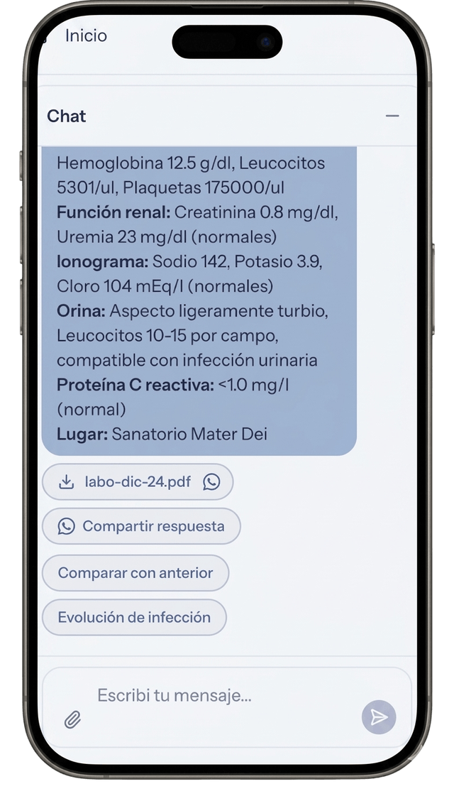
Lab results are stored segmented as key-value pairs (creatinine: 1.2, urea: 38, etc.). That enables temporal evolution queries: how did creatinine evolve over the last 6 months.
Decision 04
Voice capture in two steps
Whisper transcribes the audio. A supervisor agent processes that transcription and routes it: to event classification, to storage, to whatever applies. Two steps instead of one for cost efficiency — each model does its own thing.
Iteration 01
The medical appointment
It answered well. But format uncertainty killed its usefulness.
The scenario
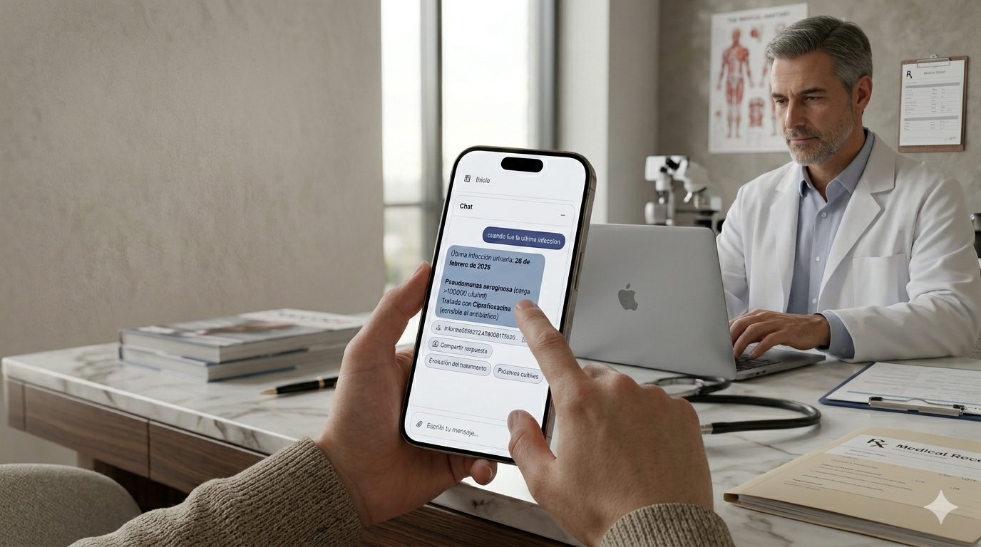
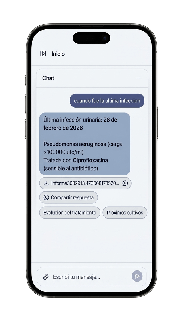
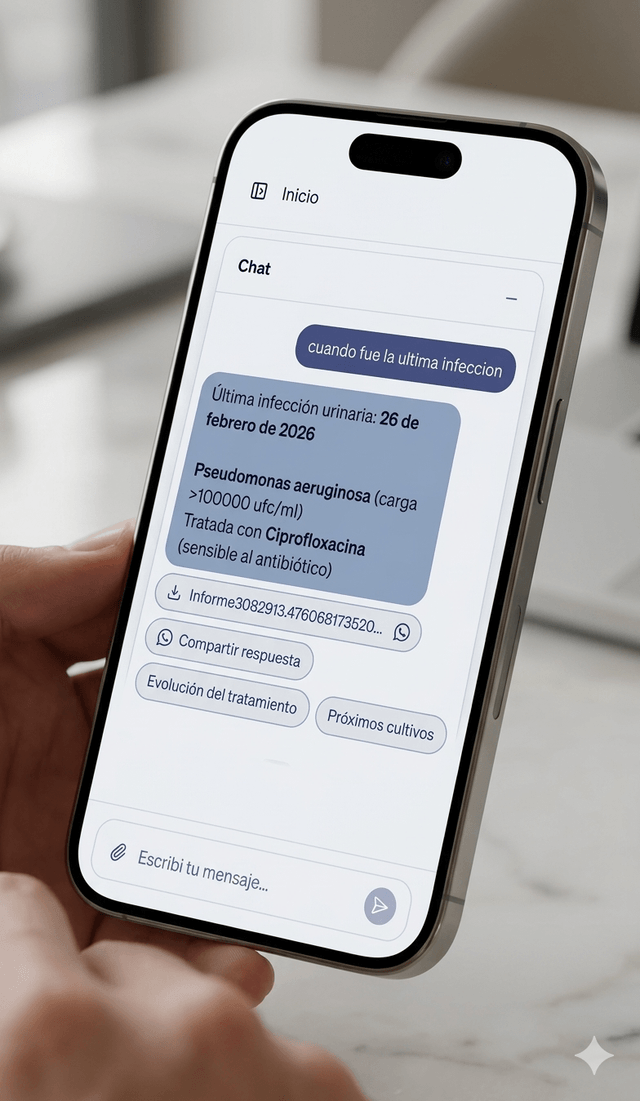
The caregiver is sitting with the doctor. Time is gold. The doctor asks about a historical data point. The caregiver queries the assistant.
I designed
The assistant returns the full event information. Dates, symptoms, studies and dosages. Technically, a precision win.
It didn't work
In real context, the answer was a dense text block. The caregiver, under pressure, couldn't afford to audit the answer to find the data point. If the user feels they have to read it three times to be sure, they lose trust in the tool and go back to paper.
I changed
I tuned the prompt for atomic answers and used visual design as a calibration signal. Key values (dosages, dates) now come out in bold and list format.
The insight
Trust is built by making verification easy. If the user can scan the data in 1 second, they dare to use it in front of the doctor.
Iteration 02
Categorization
The rigid taxonomy felt like a form. Trust requires personalization.
I designed
A closed, predictable taxonomy (surgery, urology, etc.). Easy to program, but alien to the patient's reality.
It didn't work
Each chronic patient is a unique ecosystem. Forcing their reality into standard categories generated friction. The user felt the AI didn't understand their particular case. Without that sense of understanding, there's no delegation.
I changed
I designed a classification-specialist agent that generates an emergent taxonomy. The AI keeps clinical rigor, but adapts the data tree to what the caregiver is logging.
The insight
An AI that adapts to the user's mental model builds a kind of trust a static form can never reach.
Iteration 03
Suggestion chips
The answer wasn't the end, it was the beginning of control.
I designed
Linear flow: Question → Answer → End.
It didn't work
In real care, every answer triggers an action. When was the last lab? leads to Want to share it with the doctor?. Forcing the user to type the next question in a hands-busy context broke the flow and generated frustration.
I changed
Each answer comes with contextual suggestion chips. The AI anticipates the need, but leaves the final decision in the human's hands.
The insight
Trust is a ladder of control. By offering chained actions, the user feels they're directing the AI, eliminating the black box feeling where the conversation dies.
What's next
Two architectural decisions not yet validated at scale
Thought through based on the observed usage pattern, not yet validated at scale with the model in production.
Semantic cache + delta
Historical queries repeat — when was the last infection gets asked before every appointment, before every call with a family member. Semantically caching the per-patient consolidated view and only adding the delta of new events optimizes response time and cost for patients with long histories.
Charts as the primary modality for value evolution
The caregiver doesn't need a list of numbers. They need to see the trend. For creatinine, weight, urea, anything that evolves over time, the natural output is visual.
Conclusion
Trust doesn't get fixed in the prompt
The three iterations of Eunoia Care prove my thesis in Uncovering: the most critical AI UX decisions don't live inside a single layer.
- —The medical appointment was resolved between Prompt + UI.
- —Categorization was resolved between Data architecture + Agent.
- —The chips were resolved between Prompt + Action architecture.
When we design products with AI, the goal isn't just for the model to be accurate. The goal is to design an experience where the user feels safe enough to stop supervising and start delegating.